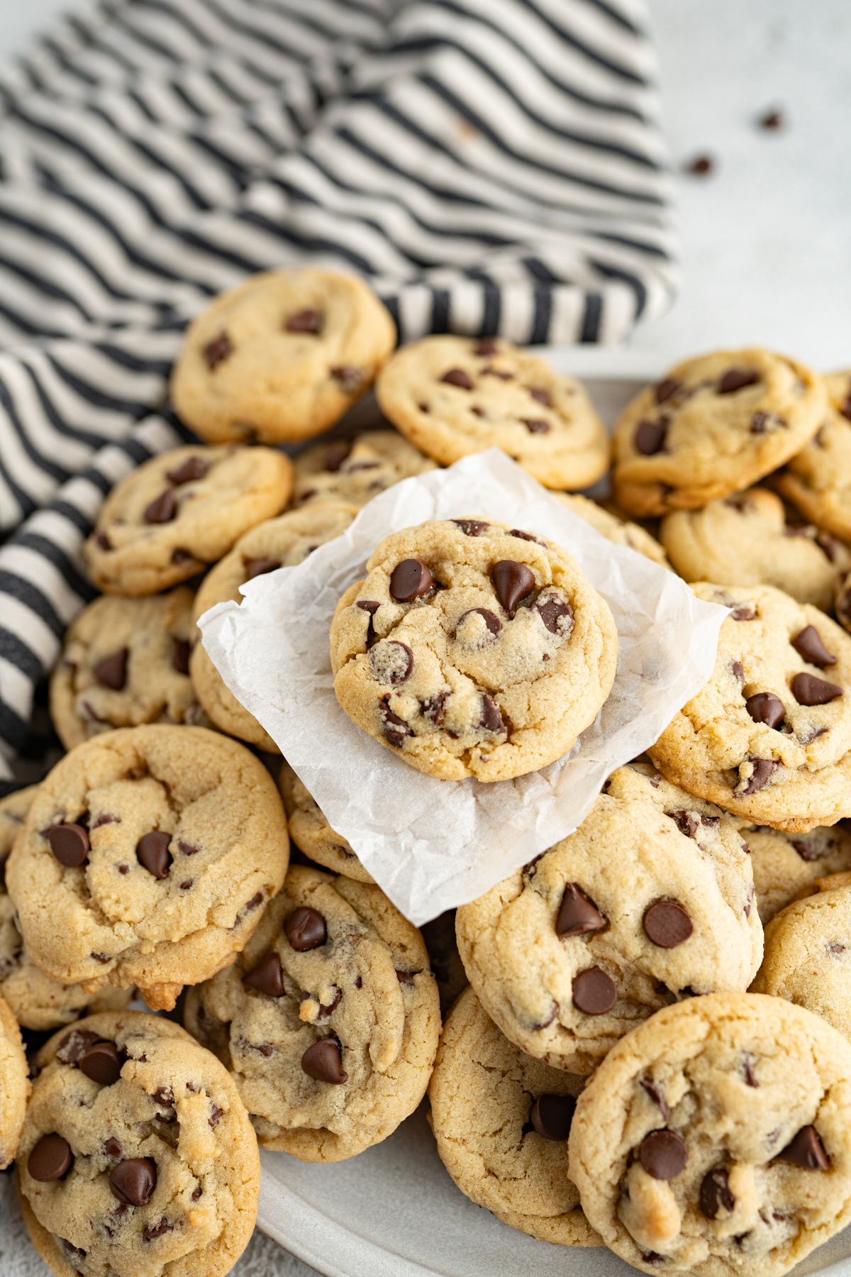
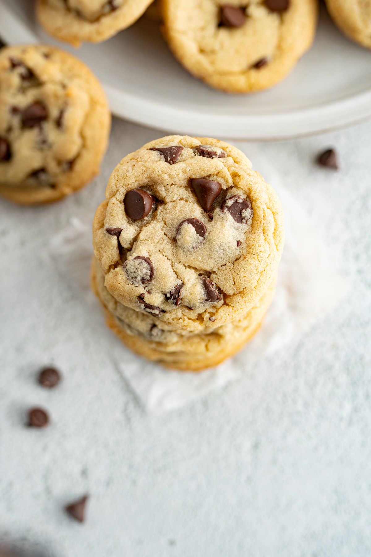
Chocolate Chip Cookies
Recipe courtesy of Food Network Kitchen
Sample imagery from Cookies for Days and Eating Bird Food
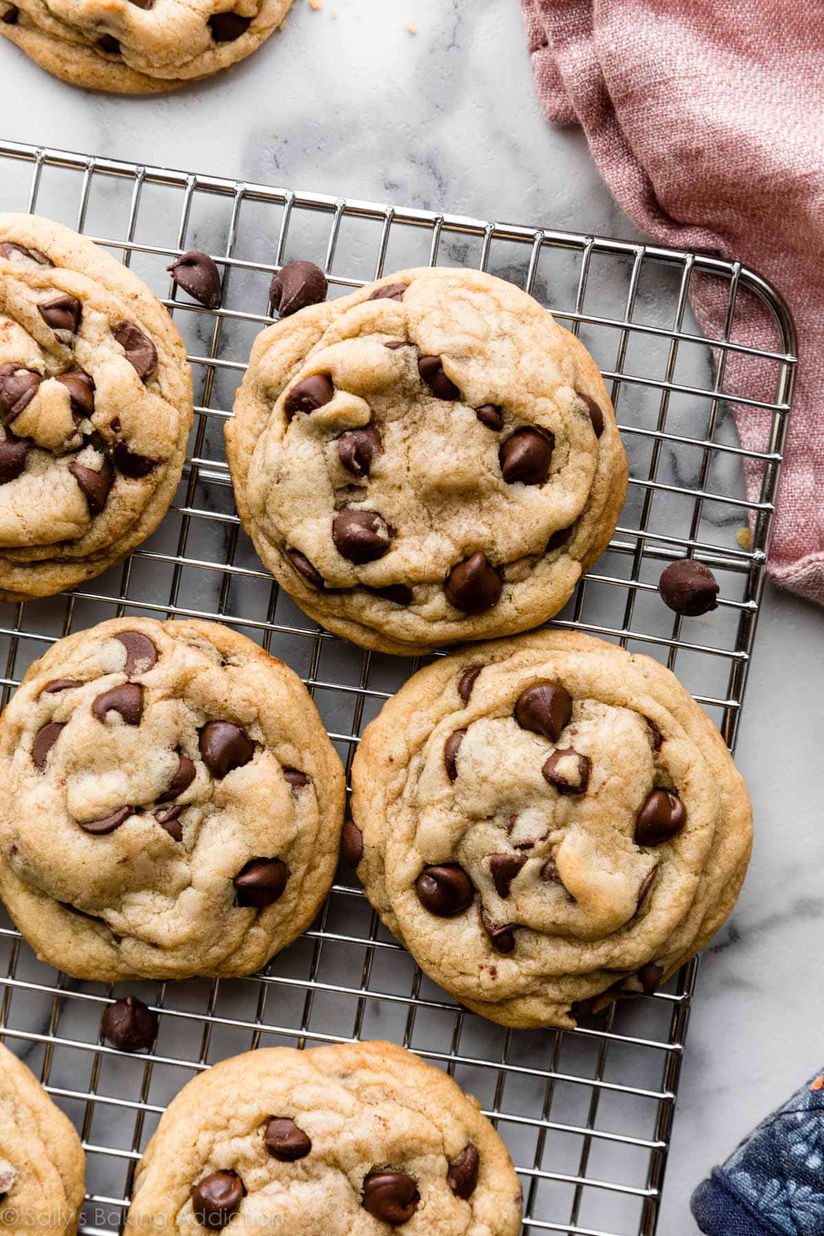
Description
“These sweet treats are the definition of cozy comfort food. They're the best of both worlds, soft in the center and crispy on the edges.”
Recipe Details
- Total time: 1 hr 5 min
- Prep time: 20 min
- Inactive: 30 min
- Cook: 15 min
- Yield: 30 cookies
Ingredients
- 1/2 cup (1 stick) unsalted butter
- 3/4 cup packed dark brown sugar
- 3/4 cup sugar
- 2 large eggs
- 1 teaspoon pure vanilla extract
- 1 (12-ounce) bag of semisweet chocolate chips, or chunks
- 2 1/4 cups all-purpose flour
- 3/4 teaspoon baking soda
- 1 teaspoon fine salt
Instructions
- Evenly position 2 racks in the middle of the oven and preheat to 375 degrees F (on convection setting if you have it). Line 2 baking sheets with parchment paper or silicone sheets. (If you only have 1 baking sheet, let it cool completely between batches.)
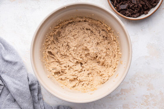
- Put the butter in a microwave-safe bowl, cover and microwave on medium power until melted. (Alternatively melt in a small saucepan.) Cool slightly. Whisk the sugars, eggs, butter, and vanilla in a large bowl until smooth.
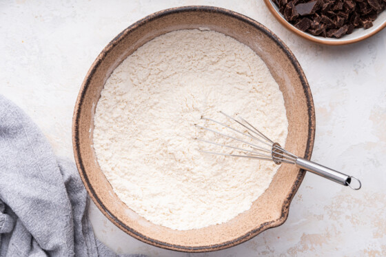
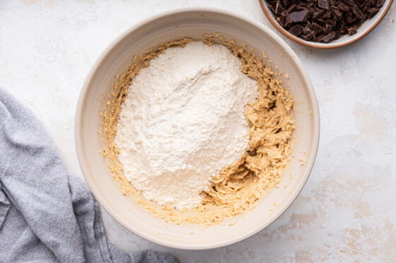
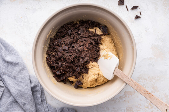
- Whisk the flour, baking soda, and salt in another bowl. Stir the dry ingredients into the wet ingredients with a wooden spoon; take care not to over mix. Stir in the chocolate chips or chunks.
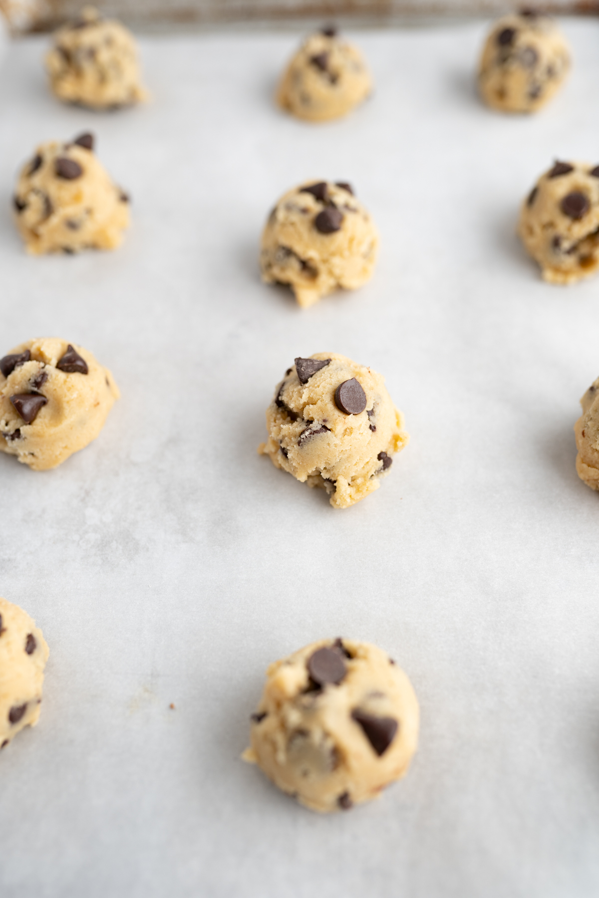
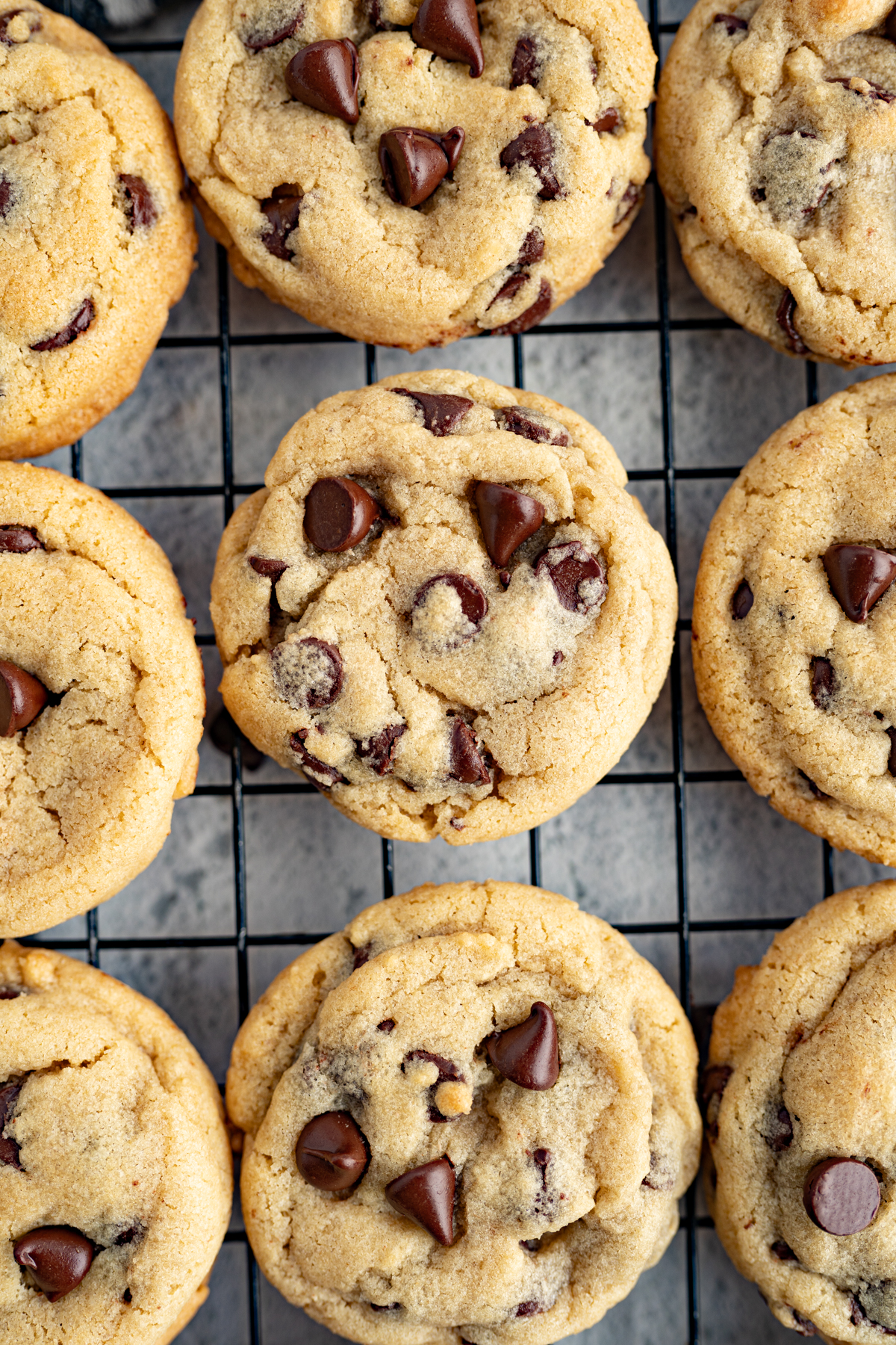
- Scoop heaping tablespoons of the dough onto the prepared pans. Wet hands slightly and roll the dough into balls. Space the cookies about 2 inches apart on the pans. Bake, until golden, but still soft in the center, 12 to 16 minutes, depending on how chewy or crunchy you like your cookies. Transfer hot cookies with a spatula to a rack to cool. Serve.
Nutrition Info
Calories: 161, Total Fat: 7g, Saturated Fat: 4g, Carbohydrates: 25g, Dietary Fiber: 1g, Sugar: 17g, Protein: 2g, Cholesterol: 21mg, Sodium: 90mg
Sample Imagery
Recipe Websites
- Minimalist Baker stands out with its clean, grid-based recipe index, making it easy to browse through recipes. I think the search bar and filtering options at the top of the page really enhance the user experience and cater to a wide range of dietary preferences. Additionally, each recipe features high-quality images, offering both visual appeal and guidance during the cooking process. However, the frequent pop-up ads can be distracting, and users often have to scroll pretty far down to reach the actual recipe.
- Damn Delicious uses stunning food photography which really elevates the website as a whole. I think the “jump to recipe” button at the top of each recipe page is a great feature, allowing users to quickly access key information without excessive scrolling. Also, the section for frequently asked questions reflects a thoughtful approach to addressing users' concerns. While the pop-up ads can be distracting, the combination of its visuals and user-focused design makes Damn Delicious an excellent resource for finding recipes.
- Tasty offers clear and concise recipe pages that avoid unnecessary details or lengthy articles. Users can easily access each recipe, making it ideal for those who value efficiency and simplicity. The layout presents all the key information at once, including a brief description, ingredients, and preparation instructions. I also really enjoy how Tasty includes a short video of the entire cooking process, which serves as a great visual aid.
Non-Recipe Websites
- Pepper Lunch has a highly engaging and interactive website. I think the scrolling effect for the step-by-step instructions on how to enjoy Pepper Lunch is clever and effective, offering a dynamic way to guide users through the process. This approach could be adapted for a recipe website to break down complex recipes into simple, actionable steps without overwhelming users.
- Noodles & Company uses bold headers to highlight menu items and promotions. The menu's layout is simple and easy to navigate, with clear categories and icons that visually distinguish the different types of noodles. Also, I think the playful, hand-drawn elements add a fun touch, making the site feel very welcoming. A recipe website could adopt some of these elements to ensure users can quickly find what they're looking for while maintaining a friendly design.
- Morning Brew features a layout perfect for users seeking quick access to information. Each article is clearly categorized with a blue heading, making it easy to navigate and find relevant content at a glance. The site delivers information in short, digestible sections, a format that recipe websites could adopt for presenting instructions. This approach ensures users can quickly find the details they need with minimal scrolling, enhancing both efficiency and user experience.
